• If you enjoy the forum please consider supporting it by signing up for a NES Membership  The benefits pay for the membership many times over.

Website critique…

The Edge Lab

Dealer
NES Member
Joined
Mar 14, 2014
Messages
1,007
Likes
1,028
Feedback: 60 / 0 / 0
My website just went live and I’m looking for feedback. I know there’s some issues with it and I have a punchlist already (my Esee’s are priced wrong, missing a few pics) but I’d really like to hear what y’all think. If you see issues let me know if you’re viewing on a phone or computer.

What’s good? What’s bad? Suggestions?… Thanks!

www.theedgelab1.com

 
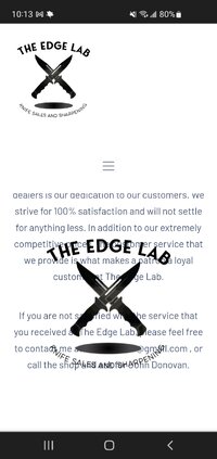
Immediate reaction: that's a lot of scrolling, and rendering isn't great (Brave browser on Android) in that your drop menu covers half the screen and your logo covers the last paragraph and a half of text.
Screenshot_20221214-101338_Brave.jpg

Also, the URL is probably going to cause trouble for you. I'm sure someone else beat you to the regular .com but appending a 1 will be tougher to remember.

(edit - phone typo and GIANT image)
 
Last edited:
At the bottom the "about" , "contact", and "order status links" appear not to work, at least not in firefox browser. At the top of page about and contact work. Viewing on a MAC laptop with firefox. Same result with Safari on the MAC.
 
Last edited:
Immediate reaction: that's a lot of scrolling, and rendering isn't great (Brave browser on Android) in that your drop menu covers half the screen and your logo covers the last paragraph and a half of text.
View attachment 697825

Also, the URL is privacy going to cause trouble for you. I'm sure someone else beat you to the regular .com but appending a 1 well be tougher to remember.
Thank you…

My logo dropping down like that is weird. It’s not supposed to do that but it does it on some phones, but no computers that I’ve tried so far. The menu does drop but that’s going to change.
 
My website just went live and I’m looking for feedback. I know there’s some issues with it and I have a punchlist already (my Esee’s are priced wrong, missing a few pics) but I’d really like to hear what y’all think. If you see issues let me know if you’re viewing on a phone or computer.

What’s good? What’s bad? Suggestions?… Thanks!

www.theedgelab1.com
i would make a default page open right into the shop, not 'home'.
the sliders bright blue - reduce color to may be darker blue, or just black, it distracts the eye into the slider from products.
i did not click much through, but design wise it looks clean enough, so, why not.

add one more dropdown to be able to alter the products amount on same page into 12-36-96. i personally hate to go across pages, i have a mouse scroll wheel that works.
1671032083787.png
 
On the home page, each of those icons for brand should be clickable and then sort your inventory by that brand

Your shopping page needs to be able to be sorted better.
Basically they are all in Knives.
What about sorting by brand?
Sort by Type (folder, non folder, kicthen, serrated/non serrated, etc)
 
You should add the ability to filter by brand on the products page.

And get rid of the picture of the ghetto street or whatever that is.

Otherwise, I think the look is pretty decent. Except the weird scrolling banner.
 
On the mobile the brands you carry come out huge and it's a long list to get to products... button size them put them at the bottom and make them hyperlinks to the products.

I haven't heard of Stedmon for example( suck it knife snobs) so I clicked the logo expecting to hit your stedmon section.
 
Limiting the listing to just 12 items at a time is lame. I shop on plenty of sites that allow you to select how many items you want to see per page. Some only go up to about 90, others allow you to pick 'all' even if it's hundreds. Also, the top nav bar flipping up/down when you scroll up is annoying as F. IF you're going to have that happen, make it smaller, or include JUST the menu items, not the logo too.

I also agree that you need to either have the logo's showing as selectable items, or allow the shopper to select brand he/she wants to look at. I'm actually in the market to get a set of Shun (classic) knives as wedding gifts for my niece and then nephew (they're marrying OTHER people :p). One is coming up at the start of Feb, the other is in June.

I also think you're not going to have an easy time competing with places like blade hq and knives ship free. Unless you're looking to get more local customers than shipping customers. I do hope you can at least survive in the cut throat market you're getting into. ;)

Also, with offering a sharpening service, you should explain more than just "contact us" for what you do. Pointing out setting the bevel to the correct angle per knife type, or even make/model is rather important to at least some of us. It's one of the reasons I avoid services at all cost. It's also why I invested a good amount of money into the sharpening setup I'm using now. Zero heat transfer to the edge during the process means I'm not ruining the blade heat treat/temper. Something that any driven abrasive will have a hard time doing. Unless you actively cool the edge as you go (there are at least a few options there). I know I'm not like most people in sharpening my own knives (as well as for some family members) but having the information as to how you do this (or at least enough to show you're serious) would be worth it IMO.
 
Looking at it on both desktop (Brave browser) & phone (Brave & Safari)

Agree w/ @Mesatchornug re the scrolling, particularly on the phone. It doesn't appear to be a mobile optimized website.

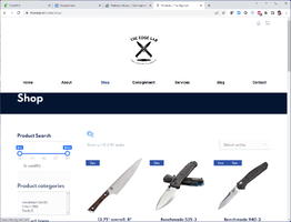
I don't understand some of the Shop Search categories (the product tags) on the desktop browser. I'd suggest a couple of different categories such as brand, style of knife, etc. Would also be good if there were some better Shop Search categories on the mobile site.

Good luck with it, looks like some nice stuff!
 
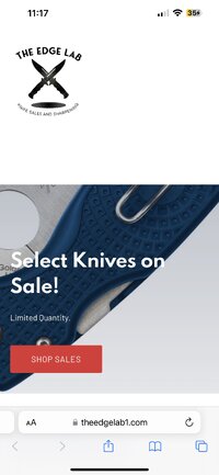
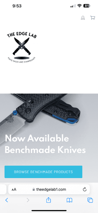
The mobile navigation is not showing on my iPhone 13 Pro Max with iOS 16.2 (the latest). If I scroll up and down a bunch it finally appears, but most people who stop by might not be willing to do that and will just move on.

IMG_6F7A12A9CC77-1.jpeg
 
Thank you…

My logo dropping down like that is weird. It’s not supposed to do that but it does it on some phones, but no computers that I’ve tried so far. The menu does drop but that’s going to change.

It actually does it on a computer too if you grab the edge of the browser window and resize manually to smaller than the intended display margin can handle. It appears to be a DIV layering/ordering issue, but one that's well beyond my ancient Web 1.0 skills could describe.

Edited to say: Most modern smart phone browsers render exactly the same as desktop browsers when not set in mobile mode.
 
I don't use a phone for web pages... just a laptop. Looks good from here... [thumbsup]
 
Did you remove the navigation in mobile mode? I cannot get the navigation drop down menu, even if I scroll up and down like I did last time.

59763977-8D9E-47A8-8A1B-09F544970C4E.png
 
Immediate reaction: that's a lot of scrolling, and rendering isn't great (Brave browser on Android) in that your drop menu covers half the screen and your logo covers the last paragraph and a half of text.
View attachment 697825

Also, the URL is probably going to cause trouble for you. I'm sure someone else beat you to the regular .com but appending a 1 will be tougher to remember.

(edit - phone typo and GIANT image)
Did that to me on duckduckgo

Also the some of our offerings our offerings h outdoor have its on clickable area not be on the home page, makes ot too cluttered.

Same with with latest products
 
My website just went live and I’m looking for feedback. I know there’s some issues with it and I have a punchlist already (my Esee’s are priced wrong, missing a few pics) but I’d really like to hear what y’all think. If you see issues let me know if you’re viewing on a phone or computer.

What’s good? What’s bad? Suggestions?… Thanks!

www.theedgelab1.com
Informative, perhaps but it'll take dedication to navigate.

Were theedgelab.com or edgelab.com not available?
 
the URL is too busy

edgelabknives.com is one I'd grab and have it direct to your site

any of the manufacturer logos on the home page should link to available product on your "shop" page

When you go to the "shop" page there is no way to narrow the search to specific manufacturers.

You have a logo for Schrade on the main page but no inventory on the shop page
 
Back
Top Bottom